The United States Certainly Look Red! 😲
Visualizing vote ratios on a county level for the 2020 presidential election
Note: If you received the email for this post, the data was wrong due to a bug in the data processing code. I apologize for that.
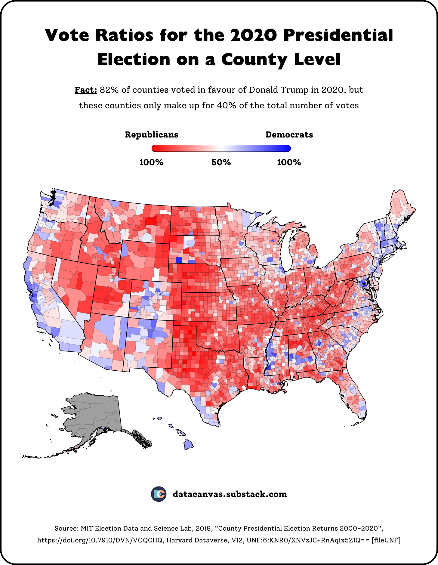
Few occasions produce more nail-biting than the US presidential election, but how do the results look on a county level? Well, have a look. 👇
What’s happening here?
Over 80% (!) of counties in the United States voted in favor of Donald Trump
But those counties only make up for 40% of the total counts
Consequently, the United States looks like a red country in this data visualization
But the blue areas are primarily cities and have significantly higher populations
Request for feedback
Let me know what you think of this design and what you want to see going forward.


